TachoDash 1.6.1: Theme Market in Image View, Plus Favorites
# TachoDash 1.6.1: Theme Market Opens in Image View, Plus a Favorites Filter
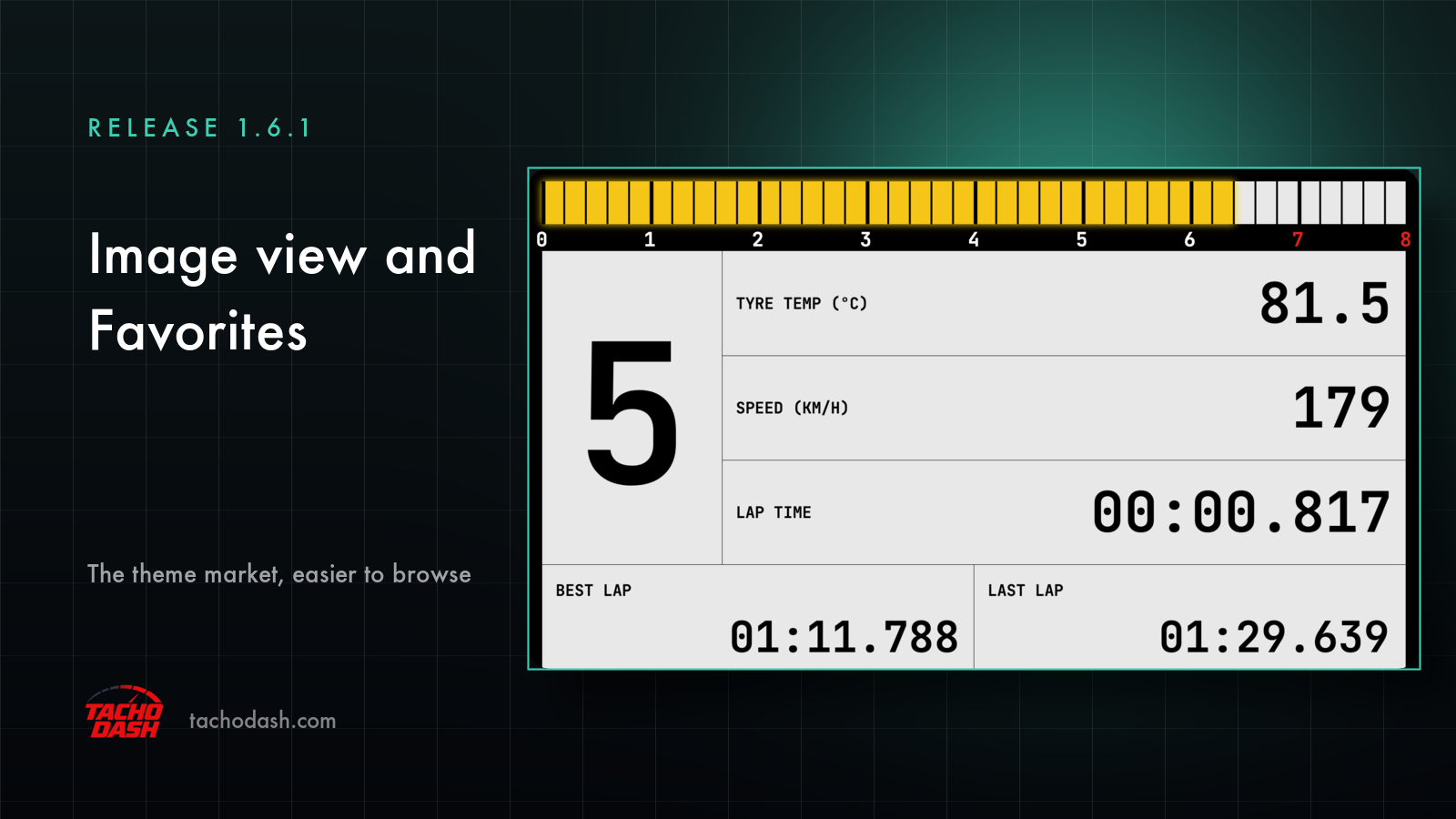
TachoDash 1.6.1 is a small release that changes how you browse the theme market, not what the app can do. Two things are different: the market now opens in image view, and there is a Favorites filter at the top.
Everything else — the dashboard, the connection, the themes themselves — is unchanged. This is a release about finding the look you want faster.
The market now opens in image view
The theme market used to open as a list. As of 1.6.1 it opens in image view: more themes fit on one screen, and every theme shows a preview of the dashboard with a button to run, buy or download it.
That sounds like a layout detail until you remember what these themes are. A TachoDash theme is a visual thing — typography, needles, colours, the way numbers are spaced. Reading a name tells you very little; seeing the cluster tells you almost everything. Image view puts the preview in the same place as the decision, so browsing stops being a sequence of guesses.
It also changes how much you can compare at once. A list gives you names in a column; image view gives you several clusters side by side, which is much closer to how you actually choose one — by looking.
List view is still one tap away
If you already know exactly which theme you want, a grid of previews is slower than a list of names. That is why the old list view is still there, one tap away, with the same content.
Nothing was removed to make room for the image view. The two are views of the same market, and switching between them costs a tap, not a reload.
A new Favorites filter
The second change is a Favorites filter. Themes you kept are marked, and the filter shows only those — which fixes the small annoyance of scrolling back through a market to re-find something you had already decided you liked.
This is the kind of feature that only makes sense once a library is big enough that you cannot hold it in your head. It is the difference between "I think there was a digital one with a big gear number" and a short list of the four dashboards you actually liked.
What the two changes have in common
Both are about the same problem: the library keeps growing, and a growing library has a browsing cost. Image view reduces the cost of scanning; Favorites reduces the cost of returning.
The themes themselves are delivered through the market, separately from app releases — so a release like 1.6.1 does not mean new dashboards arrived, and a new dashboard appearing does not mean you need to update the app. If you are looking for "what is new in 1.6.1", the honest answer is: how you browse, not what you can browse.
How to use it
- Open the app and go to the theme market. It opens in image view. Scroll; each card is a theme with a preview and its action button.
- Want the compact view? Switch to list — one tap, and the same themes are there as names.
- Found something you might come back to? Keep it, then use the Favorites filter at the top to see only those.
If you have not used a premium theme before, the market is also where the difference is explained: Theme T1 through Theme T10 are single permanent purchases ($0.99–$9.99 each), and the Monthly ($2.99), Quarterly ($7.99) and Yearly ($29.99) passes unlock the premium themes for as long as the pass is active. USD prices; local store pricing varies by region.
Who should care about this release
If you already have one theme you are happy with and never open the market, 1.6.1 changes nothing for you — and that is fine. The app keeps working exactly as before, and your theme is still your theme.
If you are the type who browses, compares, and swaps between a digital cluster and an analog one depending on the car or the mood, this release is aimed squarely at you. The browsing loop is faster in both directions: in, and back.
What has not changed
Worth stating plainly, because release notes tend to imply more than they say:
- The connection is the same native UDP link over Wi-Fi.
- Units are still set independently (km/h or mph, bar or psi), and theme parameters such as colour are still adjustable.
- Free themes and premium themes work the way they did; nothing was moved behind a paywall in this release.
- The app still runs on the phone or tablet you already own, with no PC involved.
If something feels different after updating and it is not one of the two changes above, it is worth reporting rather than assuming it was intentional: [email protected].
Where this fits
1.6.1 follows 1.6.0, which brought theme descriptions in your language. Read together, the two releases are the same idea from two directions: make the library easier to understand (descriptions you can read) and easier to browse (previews and favourites).
Neither release adds a theme. Both make the themes you already have easier to find — which, in an app whose value is the look of the cluster in front of you, is not a small thing.
Get TachoDash
TachoDash is available on the App Store and on Google Play. Browse the theme library to see what the app looks like before installing, or start with what TachoDash is.
TachoDash is an unofficial fan-made project, not affiliated with Playground Games or Microsoft.
Get TachoDash: